11400 W Olympic Blvd Ste 200
Los Angeles, CA 90064-1584
Phone Number
Exploring the unexpected connections that shape our lives
Book Reviews, Comments & Stories, Quotes, & Poetry & More
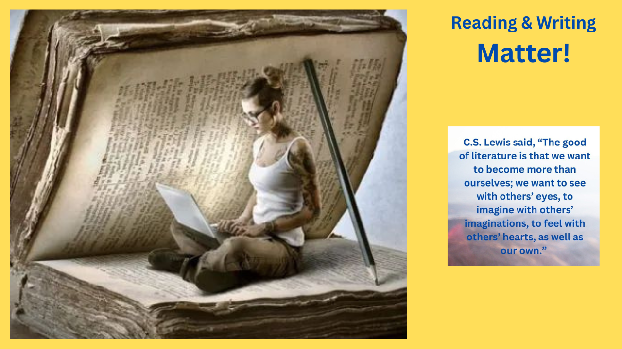
"Connections and Why They Matter"
Most of what happens in our life will spark a connection. Life connects with what has been found in books. Books connect with what happens in life. Use the connections to help you see more clearly. A love of reading and writing is what motivated the creation of this blog. Thank you for coming to the blog.
3
ff
Th