Book Reviews, Comments & Stories, Quotes, & Poetry & More
"Connections and Why They Matter"
Most of what happens in our life will spark a connection. Life connects with what has been found in books. Books connect with what happens in life. Use the connections to help you see more clearly. A love of reading and writing is what motivated the creation of this blog. Thank you for coming to the blog.
Color is the prompt that gets your audience to see what you want them to see, feel what you want them to feel, and do what you want them to do.
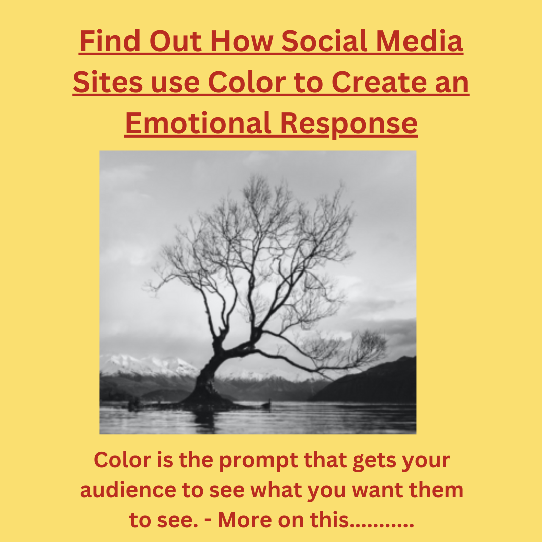
Gray is reassuring and suggests simplicity, wisdom, calmness, and feelings of practicality, old age, and solidarity. It also can carry some negative implications, such as depression and loss.
Research by the University of Winnipeg, Canada, on the impact of color on marketing states that people make up their minds within 90 seconds of their initial interactions with either people or products. With products, as much as 90% of their decision is based on color, and social media experts use it to create an emotional response. The following list shows some of the colors’ positive and negative influences.
All colors have positive and negative effects, and the messages change with the intensity and tone of the color changes. The challenge is picking the right color must be balanced against the potential of unintended consequences.
The gray in the picture here was picked because it imparts wisdom, and if you don’t believe that, then the reason was to offer calmness if you don’t accept the knowledge here.